Curva - Scoliosis & Spinal Fusion Specialists
Services: Mini Brand Package
Project Brief: Build & Breathe Scoliosis approached me to rebrand as ‘Curva – Scoliosis and Spinal Fusion Specialists.’ Their goal was to modernise their logo, making it relatable for their growing audience. Originally targeted towards women and girls with scoliosis through pilates, Curva has expanded into physiotherapy, working closely with spinal surgeons. They needed a brand that balances empowerment and community with a professional, medical feel. The challenge was to create a brand identity that feels both fun, modern, and feminine, while still professional and clinical to reflect their medical expertise.
Solution: I designed a logo that captures both the medical and community aspects of Curva by incorporating abstract, intertwined 'S' shapes to represent scoliosis and togetherness. This was paired with a soft yet medical-inspired colour palette, along with mockups that highlight the logo’s versatility, balancing the brand's empowering, feminine elements with its clinical, professional side.
I’m excited to say that this project has been chosen to be featured among The Best Minimal Logo Designs of 2025 at DesignRush, known for its best design awards.
Colour Palette
I selected a colour palette that is both soft and approachable yet retains a medical undertone. The blend of muted tones and blues/greens represents the dual focus of the brand – feminine and clinical.
Logo Concept
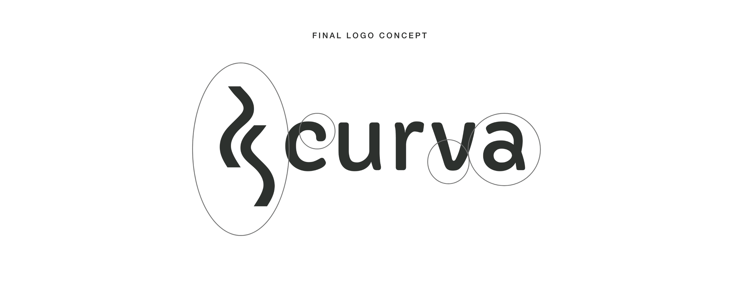
I designed a logo that captures the balance between femininity and professionalism. The two 'S' shapes at the beginning of the logo symbolise the curved spine associated with scoliosis. Many medical logos often feature a spine graphic with vertebrae, but we wanted something more modern, playful, and relatable for Curva’s target audience. Instead of a literal or anatomical representation, I chose a more abstract and stylised design.
I opted for two spines rather than one, and made them intertwine to symbolise the idea of community – bringing individuals with scoliosis together, rather than standing alone. This visual choice reflects Curva's mission to create an empowering and supportive space where patients feel connected and understood, breaking away from the isolating feel that the medical industry can sometimes bring.
Additionally, the letter ‘a’ in the logo has a unique curvy effect, reinforcing the brand’s focus on curvature while adding a playful element that complements the overall design. This detail, along with the rounded, soft typography, helps the logo feel warm and welcoming while maintaining a professional tone to reflect their medical expertise.
Brand Mockups
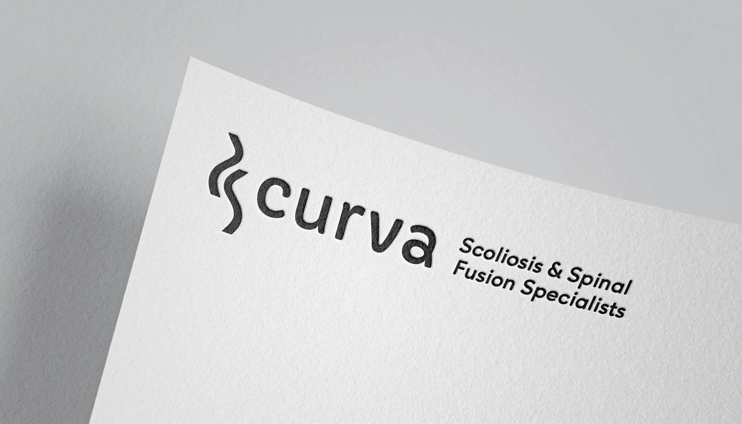
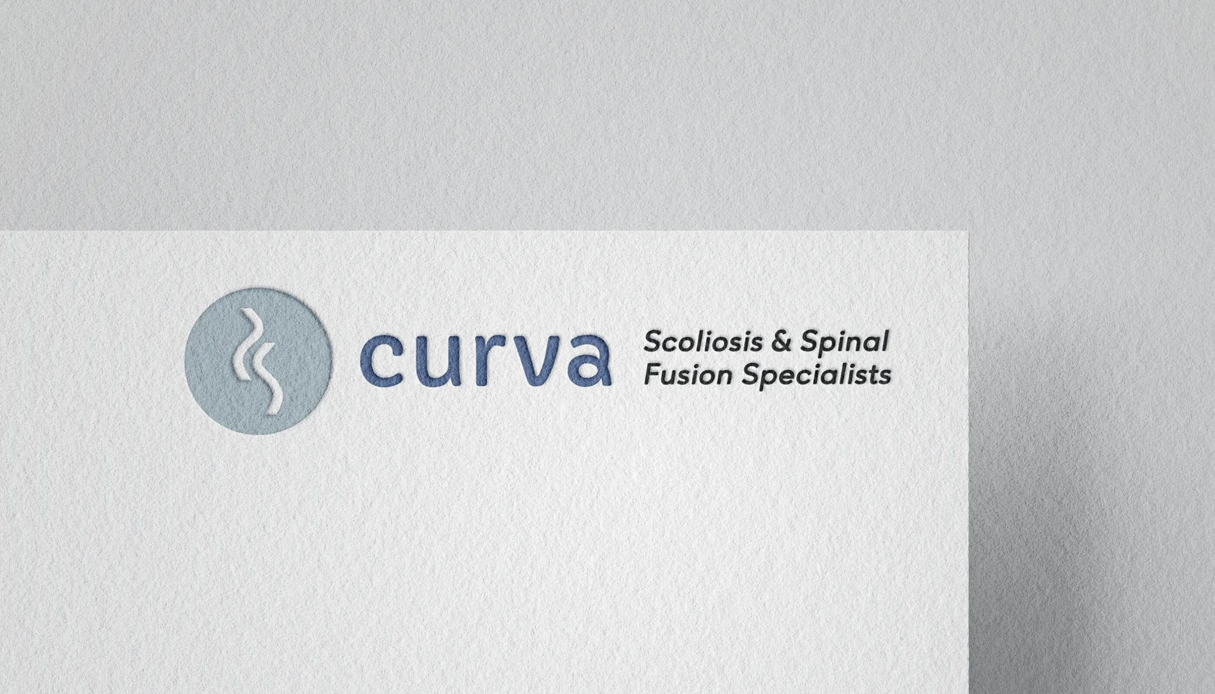
To showcase the logo’s versatility, I created a range of mockups. These highlight how the brand can flex between a more feminine, approachable look (e.g., on yoga mats and business cards for pilates) and a clinical, professional presentation (e.g., on lanyards for the physiotherapy side). This hybrid approach ensures Curva appeals to both their patient community and medical professionals.


