Nova Inner Sustainability
Services: Brand Strategy, Brand Identity, Website Design, Marketing Assets
Project Brief: The Nova Inner Sustainability founder approached me during the early stages of building their vision—a transformative programme that blends personal growth with real-world impact. They required support in crafting a cohesive brand strategy, identity, website design, and marketing assets to bring their idea to life.
Solution: I began by immersing myself in the brand strategy, defining Nova’s core mission, goals, target audience, and competitive landscape. From there, I developed a dynamic and cohesive brand identity that speaks directly to Nova's socially conscious audience. Nova Course now has a visually striking and purpose-driven brand identity that connects with its target audience and inspires action. With a modern website, cohesive branding, and versatile marketing assets, the business is equipped to empower individuals on their journey of transformation and sustainability.
Brand Mission
The Nova Course: The course is designed as a journey of holistic development, empowering individuals to grow personally while initiating sustainability projects. Rooted in the belief that everyone has the potential to create positive change, the programme combines personalised coaching, inner development training, and hands-on project creation.
Target Audience: The ideal Nova Course participant is aged 18–50, passionate about personal growth, sustainability, and social impact. They value authenticity, collaboration, and community, aiming to create a more interconnected, sustainable future.
Key Themes: Transformation, Empowerment, Sustainability, Connection, Impact.
Logo Concept
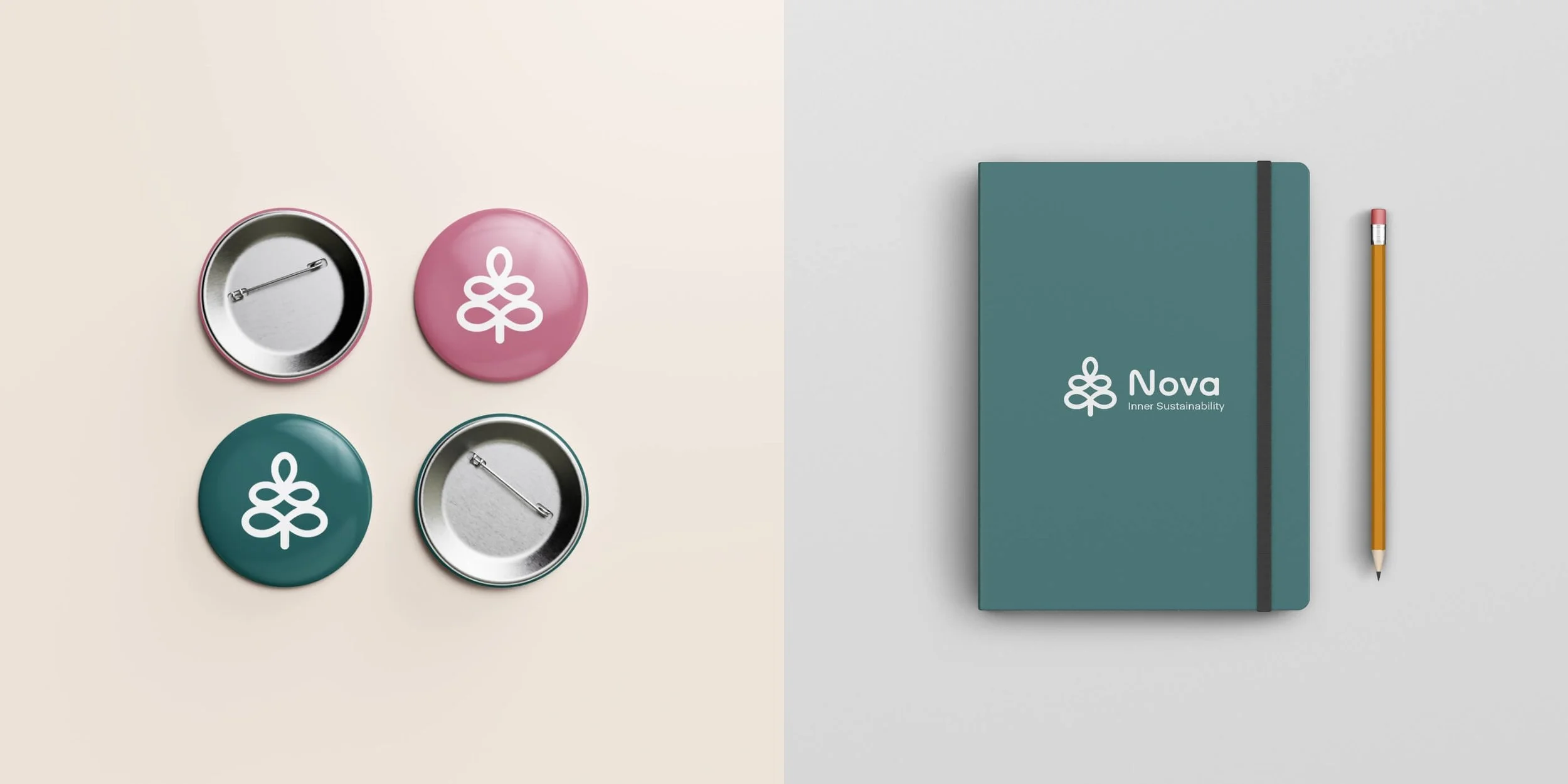
The logo combines an infinity symbol with a tree motif, representing the interconnectedness of personal growth and global sustainability.
Infinity: Symbolises endless possibilities and the ongoing journey of development and impact.
Tree: Embodies sustainability and growth, with five branches representing the programme's pillars:
Personal Growth
Sustainable Development
Coaching & Mentoring
Community
Personal Projects
Icons
I custom-designed five unique icons to represent each of the core pillars of the Nova Course. Each icon reflects the pillar's essence, contributing to a cohesive and visually engaging brand experience.
Personal Growth: A symbol of inner development and continuous learning.
Sustainable Development: Representing environmental consciousness and responsible action.
Coaching & Mentoring: Emphasising guidance, support, and collaboration.
Community: Reflecting connection, inclusivity, and shared goals.
Personal Projects: Highlighting creativity, innovation, and tangible outcomes.
These icons are integrated across the website, marketing materials, and presentations to reinforce the brand's message and improve user engagement.

Colour Palette
The colour palette reflects Nova’s mission of positivity, inspiration, and growth:
Primary Colours: Shades of green to embody sustainability and nature.
Accent Colours: Bright yellows, oranges, blues, and purples to evoke optimism, creativity, and empowerment.
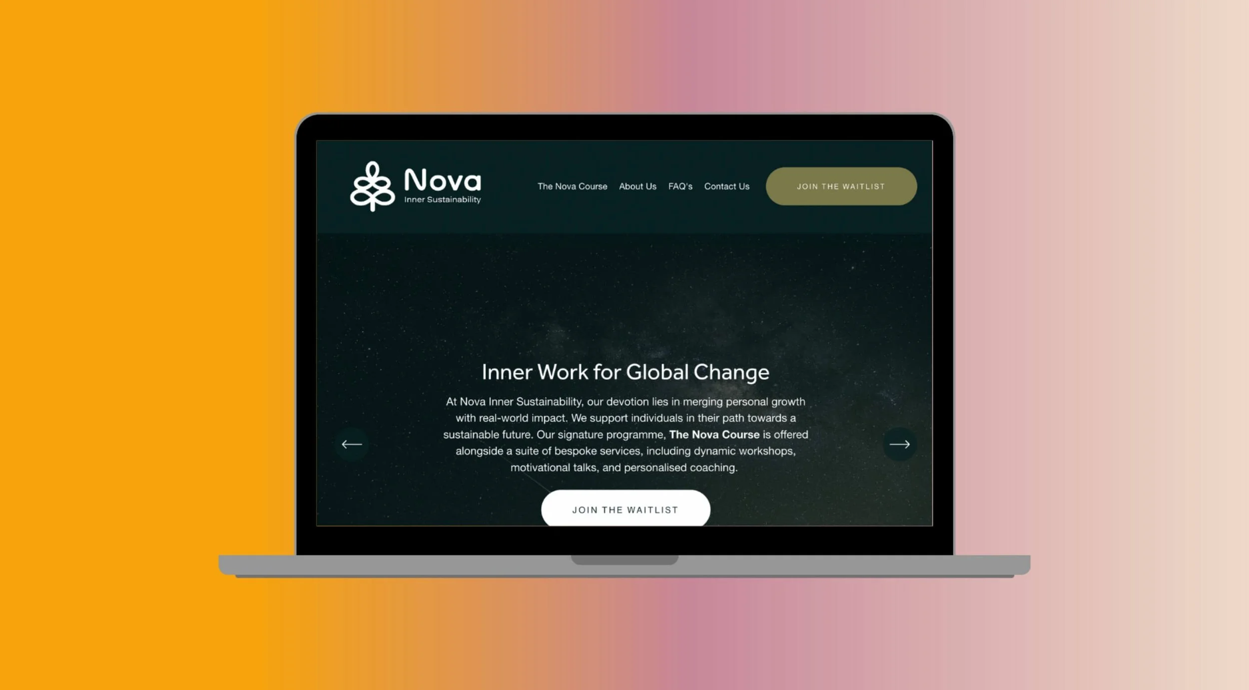
Gradients: Dynamic colour blends used for website backgrounds and marketing materials add a modern, uplifting feel.
Marketing Assets
I developed a range of mockups and marketing assets showcasing the brand in action, reinforcing its community-focused ethos:
Collateral: Notebooks, stickers, wristbands, badges, and t-shirts.
Digital Presence: Website design featuring bold gradients, dynamic visuals, and intuitive navigation.
Presentation Templates: Branded slides to inspire confidence and consistency in workshops and pitches.