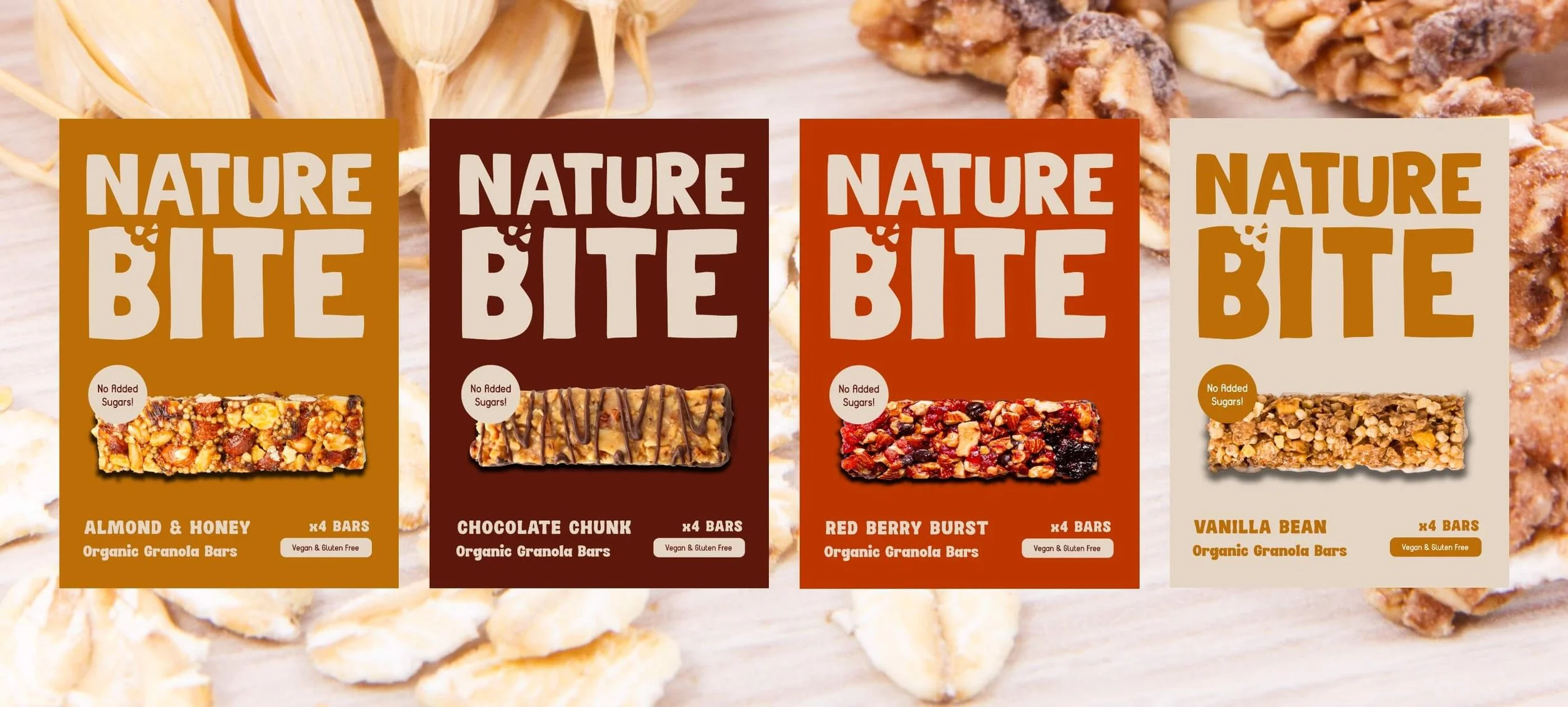
NatureBite: Organic Granola Bars
Services: Brand Identity, Label Design, Packaging
Project Brief: NatureBite is a conceptual brand* offering nutritious granola bars and bliss balls made with organic, locally sourced ingredients. Their products are vegan, gluten-free, and ethically made, targeting health-conscious individuals, families, and fitness enthusiasts who value sustainability and wholesome snacks.
Solution: To capture the essence of NatureBite, I developed a visually appealing brand identity which emphasises quality, sustainability, and natural ingredients.
* As I'm all about transparency, I wanted to note that the following project was created as a conceptual portfolio project rather than for an actual client. Conceptual projects serve the purpose of aligning my portfolio with projects I feel most passionate about, showcasing my design skills, and displaying the kind of brands I'd like to see more of in the world.
Logo Concept
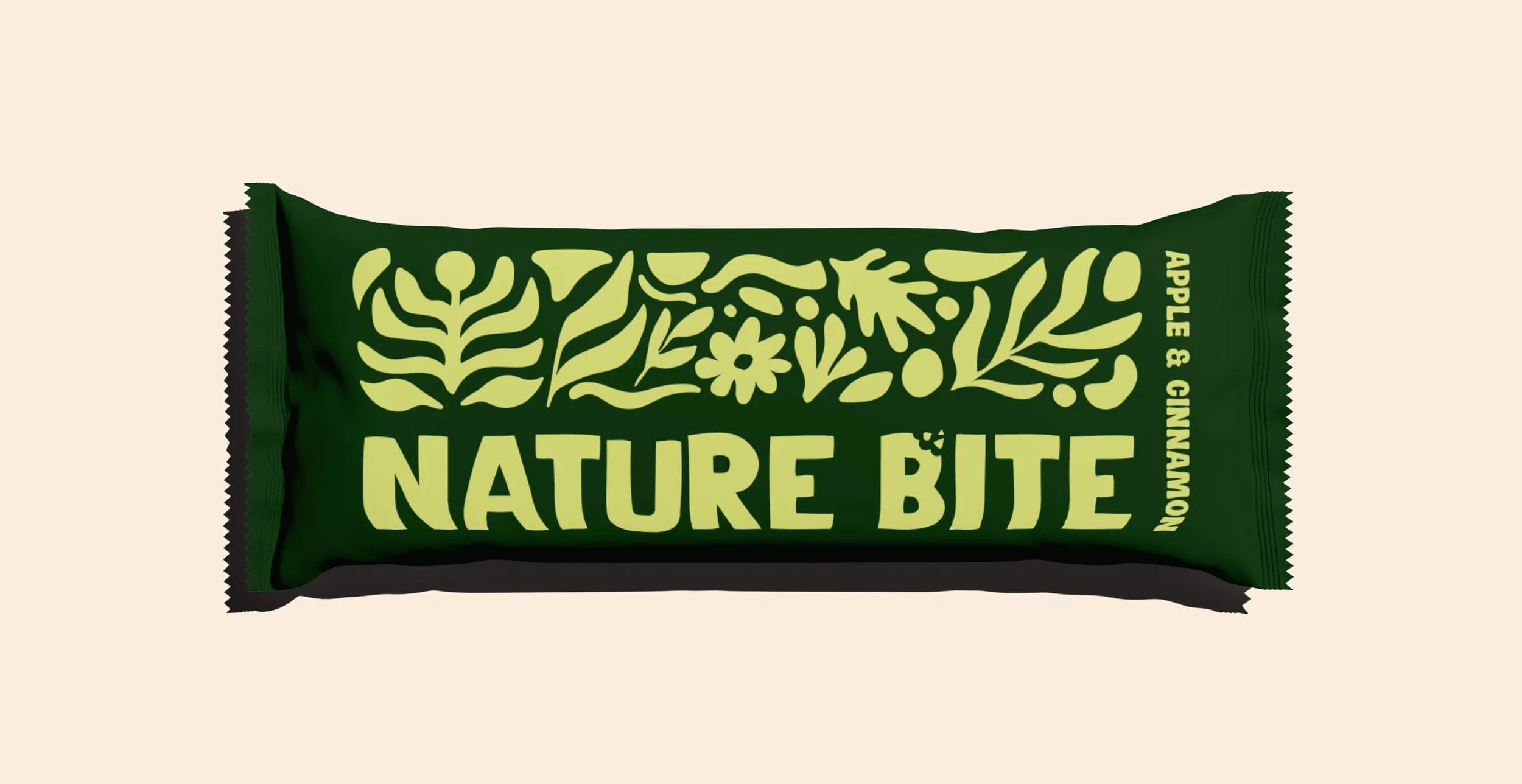
The typography used for the logo has been customised to have a ‘rough’ and imperfect feel, symbolising natural and organic elements. This gives the logo a hand-made, artisanal touch. The letter ‘B’ has a bite taken out of it, with bits crumbling away. This not only visually represents taking a bite out of a granola bar but also plays on the word ‘Bite’ in NatureBite.
Colour Palette
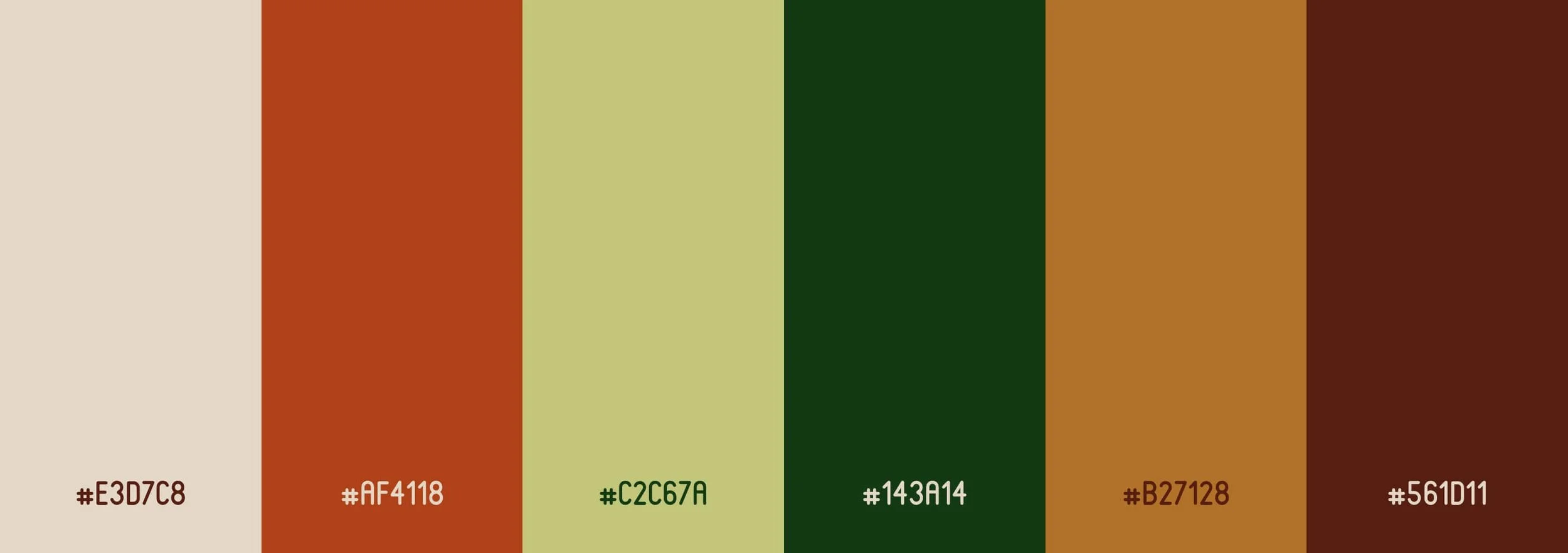
A warm and earthy colour palette was chosen to reflect the natural and organic qualities of the product. The colours are more saturated to ensure they stand out on the shelves, avoiding the blending effect of more muted tones. High-contrast colours were selected to maintain visual interest and ensure the packaging is eye-catching.
Font Selection
The fonts used in the brand identity are bold and rounded, aligning with the energetic and wholesome nature of granola bars. The contrast between the rounded fonts for headings and body text and the pointy edges of the logo type creates a friendly yet distinct look, ideal for the target audience.
Label Design
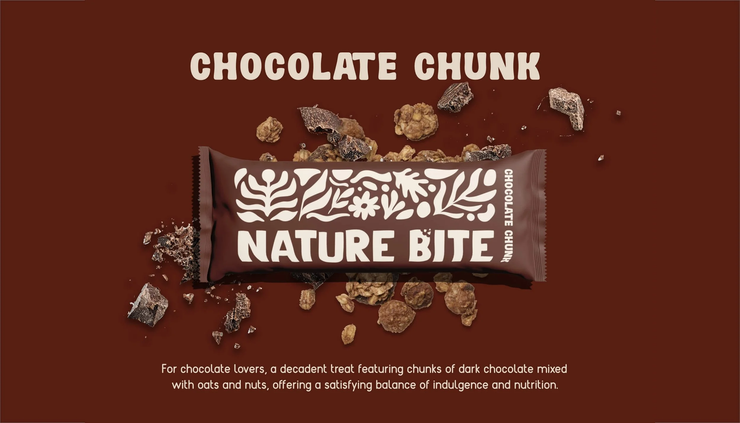
The label designs focus on simplicity and clarity. The use of two-tone colour schemes ensures high contrast and readability, enhancing shelf appeal.
