Shoot Children’s Clothing
Services: Brand Naming, Brand Identity, Packaging, Print Design
Project Brief: 'Shoot' is a conceptual brand* aiming to revolutionise the children's clothing industry by offering second-hand clothing for eco-conscious parents. The brand's mission is to provide sustainable options for kids that are environmentally friendly and support their growth.
Solution: I developed a brand identity that reflects 'Shoot's commitment to sustainability and innovation in children's fashion. The name 'Shoot' was chosen to embody the values of sustainability, growth, and eco-consciousness. The brand personality is playful, modern, earthy, approachable, and relatable. The branding was expanded into print, packaging, and digital marketing assets to maintain a cohesive brand message throughout.
* As I'm all about transparency, I wanted to note that the following project was created as a conceptual portfolio project rather than for an actual client. Conceptual projects serve the purpose of aligning my portfolio with projects I feel most passionate about, showcasing my design skills, and displaying the kind of brands I'd like to see more of in the world.
Logo Concept
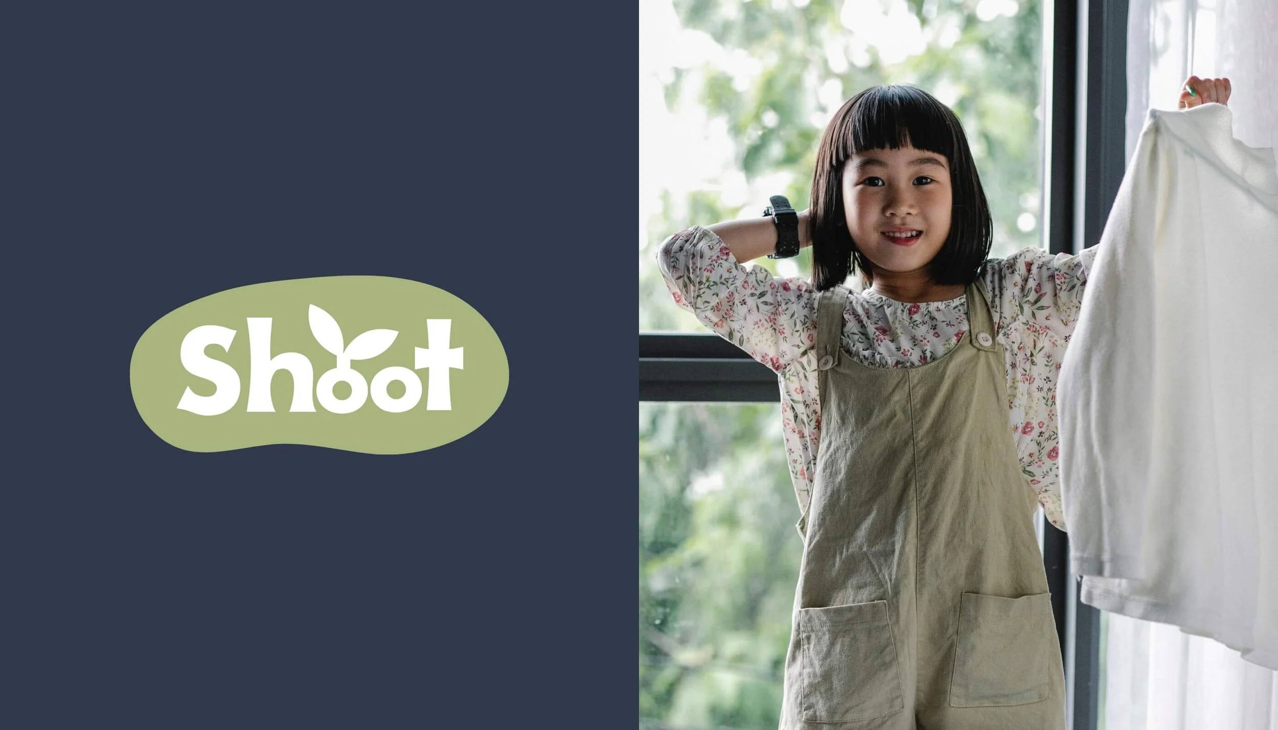
The name ‘Shoot’ is a playful double entendre. It symbolises both the growth of children, akin to sprouting from a bean, and echoes the humorous sentiment of parents exclaiming, "Oh shoot, they grew again!" as they deal with their kids constantly outgrowing their clothes.
The primary logo embodies this concept with the text encased in a 'bean' shape, symbolising the nurturing and growth process. Additionally, one of the ‘o’ letters in 'Shoot' is designed to sprout a small shoot, visually representing the idea of growth and development. The typography is bold yet retains a youthful and playful vibe, making it an ideal fit for a brand centred around children’s clothing. This approach ensures that the logo is both engaging and reflective of the brand’s core values of sustainability and growth.
Colour Palette
The chosen colour palette is grounded in earthy tones that are both bold and playful, providing a child-like feel to the brand while maintaining an eco-friendly aesthetic. The primary colour is green, representing the green shoot sprouting. This colour reflects the brand’s core values of sustainability and eco-friendly fashion, symbolising growth, renewal, and a connection to nature. The supporting colours add depth, warmth, and balance to the palette. They appeal to both genders, convey trustworthiness, reinforce the brand's commitment to sustainability while also being engaging and attractive to children and parents alike.
Font Selection
A rounded sans-serif font has been chosen for the main text. This font is modern, yet soft, perfectly symbolising the brand's dedication to children and the environment. Its clean and approachable design ensures readability while conveying a sense of warmth and care. The accent font is a playful handwriting style, resembling a child’s newly practised cursive writing. This choice adds a friendly, relatable, and approachable touch, making the brand feel more personal and engaging for both children and parents.
Icons & Illustrations
The branding pack includes a wide variety of hand-drawn illustrations. These free-hand sketches enhance the playful and child-like appeal of the brand, making it relatable and engaging for both children and parents. The icons represent key themes such as clothing, growth, sustainability, packaging, and posting items. They also include clothing tags, shapes, and symbols. Each icon is designed to visually communicate the brand’s values and services in a clear and friendly manner. These illustrations and icons not only add visual interest but also reinforce the brand’s commitment to sustainability and its focus on children's fashion.


