Perfect Pear Denim
Services: Brand Naming, Brand Identity, Packaging, Print Design
Project Brief: Perfect Pear Denim is a conceptual brand* dedicated to providing high-quality, comfortable jeans specifically designed for pear-shaped women with fuller hips and smaller waists. Their mission is to celebrate and empower the unique body shapes of women while offering stylish and flattering denim options. The aim is to create a distinct and empowering brand identity that resonates with this target audience and positions Perfect Pear Denim as the go-to brand for pear-shaped women seeking stylish and well-fitting jeans.
Solution: I developed a compelling brand identity for Perfect Pear Denim that effectively communicates its mission and values. Starting with a unique and memorable brand name, I crafted a minimalist yet impactful logo that embodies the brand's ethos. Messaging across all brand touch-points was crafted to celebrate body positivity and the uniqueness of pear-shaped women. Consistent branding was implemented across various marketing materials, including social media, print, and packaging design.
* As I'm all about transparency, I wanted to note that the following project was created as a conceptual portfolio project rather than for an actual client. Conceptual projects serve the purpose of aligning my portfolio with projects I feel most passionate about, showcasing my design skills, and displaying the kind of brands I'd like to see more of in the world.
Brand Naming
Brand Name: Perfect Pear Denim
Tagline: Perfect Fit for Pear-shaped Beauties
‘Perfect Pear Denim’ was chosen as an empowering brand name that directly speaks to and resonates with the target audience: women with pear-shaped figures.
The name promotes self-love by celebrating the idea of being 'the perfect pear' and embracing one's unique body shape. It also cleverly plays on the concept of finding the 'perfect pair' of jeans tailored specifically to fit and flatter their figures. The brand name encapsulates both the mission of body positivity and the promise of providing stylish, well-fitting denim
Logo Concept
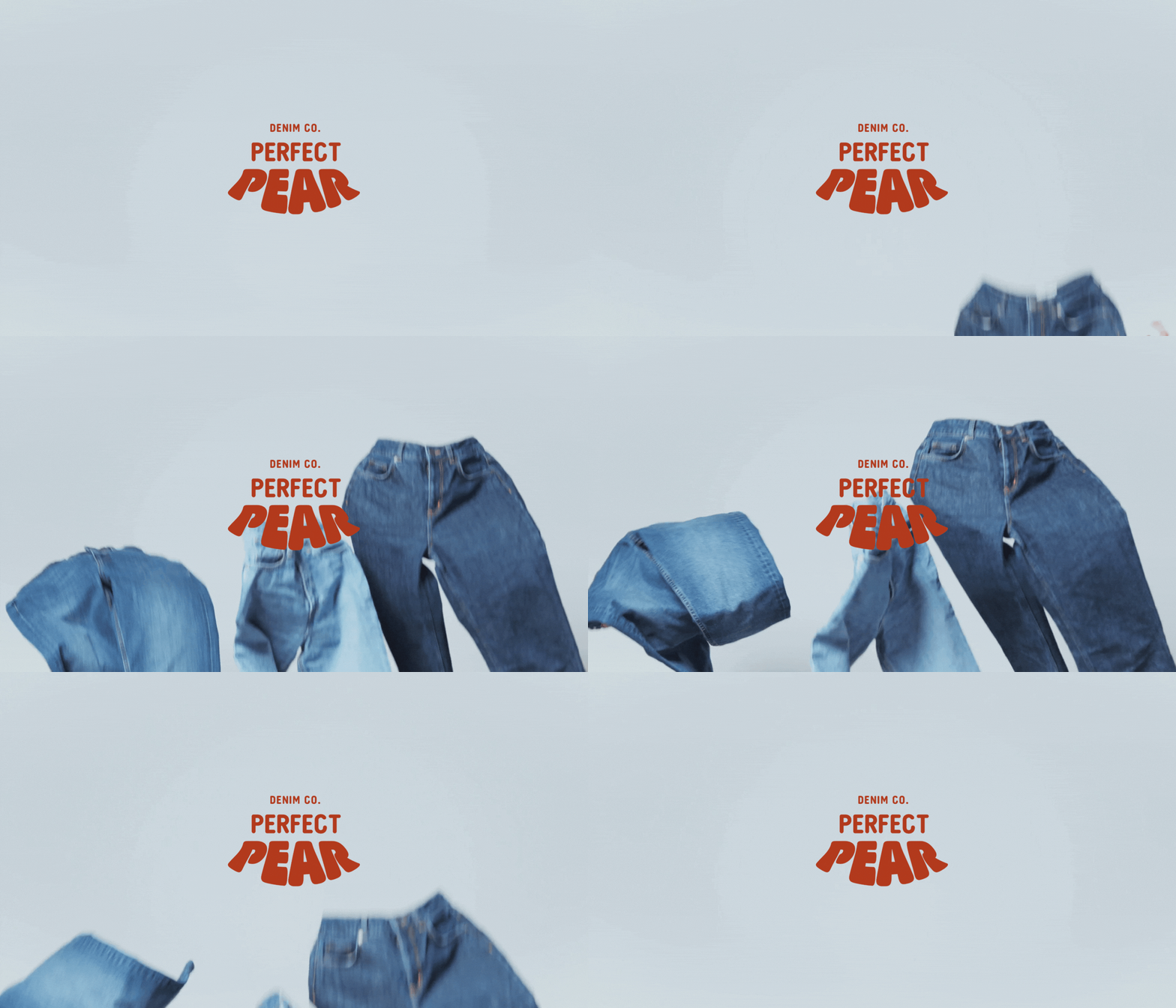
The logo for Perfect Pear Denim is bold and unapologetic, designed to instantly convey the brand's message. The stacked arrangement of the logo resembles the shape of a pear, being narrower at the top and wider at the bottom. I custom-manipulated the word ‘pear’ so that the letters themselves taper at the top and flare out at the bottom, creating a rounded effect. This design not only mimics the shape of a pear but also symbolises the fuller hips and smaller waists characteristic of pear-shaped women.
The primary logo features the full design with a pear icon, while the secondary logo includes just the text. The brand submark simplifies this to just the letter 'P', maintaining recognisability and flexibility across various applications.
Colour Palette
The colour palette for Perfect Pear Denim was thoughtfully chosen to reflect the brand's identity and values. The primary colour is a light blue shade, symbolising denim and reinforcing the brand's focus on high-quality jeans. The sand colour adds warmth to the palette while remaining a light shade, ideal for backgrounds and providing a subtle contrast to the other colours. The green shade reflects the 'pear' concept, mirroring the fruit's natural colour. This hue also introduces a natural and organic feel to the brand, emphasising positivity and the brand’s commitment to sustainability. Lastly, the red colour serves as an accent, used sparingly to create a striking contrast with the blue, ensuring a vibrant and attention-grabbing combination.
Socials
For Perfect Pear Denim's social media strategy, I focused on promoting body positivity and incorporating humour to celebrate the unique figures of pear-shaped women. The campaign #shareyourpear encourages customers to share photos of their 'booties' in their Perfect Pear jeans. This playful and empowering hashtag invites users to embrace their body shape and join a supportive community. The best entries will be reposted on Perfect Pear Denim’s Instagram, featuring the 'Perfect Pear' logo stamped over the photo, further engaging our audience and showcasing real customers proudly wearing their jeans. This approach not only enhances brand visibility but also fosters a sense of inclusivity and confidence among their followers.
Billboard Ad
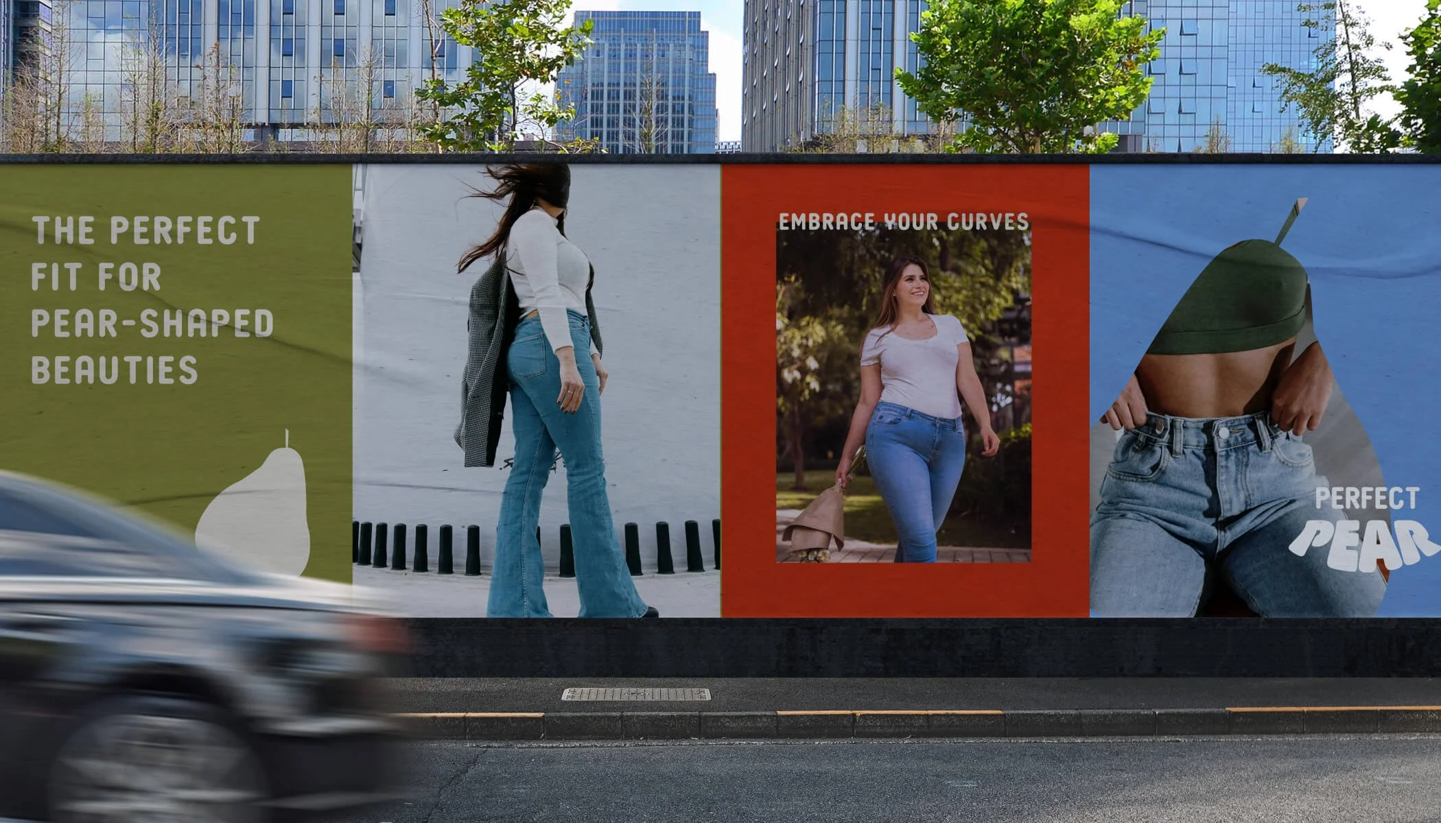
The billboard ad for Perfect Pear Denim uses bold colours from the palette to create a striking and attention-grabbing display visible from a distance. Featuring fashion models wearing their jeans, the ad instantly communicates that it’s a denim line. The image shaped like a pear, with the Perfect Pear logo prominently displayed, reinforces the unique selling point of jeans specially tailored for pear-shaped women. The empowering taglines ‘Embrace your curves’ and ‘The perfect fit for pear-shaped beauties’ resonate deeply with the target audience, celebrating their unique body shapes and promoting the perfect fit the jeans offer.
Packaging
The packaging design for Perfect Pear Denim is simple yet effective, utilising craft mailer boxes for a sustainable option. The minimalist approach underscores the brand's commitment to eco-friendly practices. The Perfect Pear logo is prominently stamped on the packaging, creating a cohesive and memorable brand experience from the moment the customer receives their order. This thoughtful design not only reinforces brand identity but also aligns with the values of sustainability and quality that Perfect Pear Denim embodies.


