Period Pal
Services: Brand Naming, Brand Identity, Print & Packaging Design
Project Brief: ‘PeriodPal’ is a conceptual* menstrual cup brand dedicated to destigmatising menstruation and providing support for menstruators. Born from a passion for challenging societal norms, PeriodPal's mission is to create an inclusive, empowering, and positive brand identity that breaks the taboos surrounding periods.
Solution: To bring PeriodPal’s vision to life, I developed a bold and unapologetic branding concept that embraces vibrant colours, playful typography, and inclusive imagery. This approach aims to disrupt stereotypes and celebrate the natural process of menstruation.
*As I'm all about transparency, I wanted to note that the following project was created as a conceptual portfolio project rather than for an actual client. Conceptual projects serve the purpose of aligning my portfolio with projects I feel most passionate about, showcasing my design skills, and displaying the kind of brands I'd like to see more of in the world!
Logo Concept
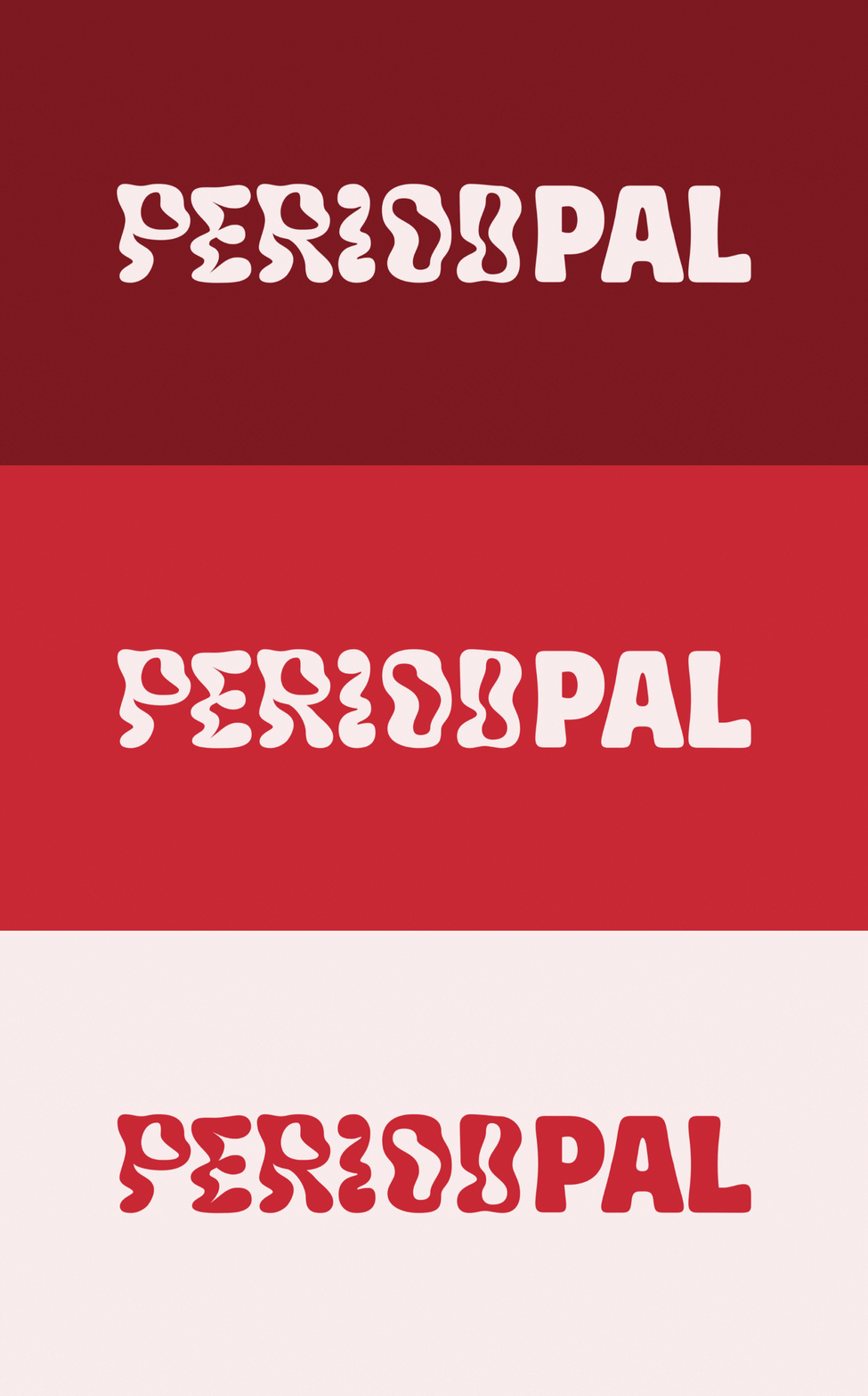
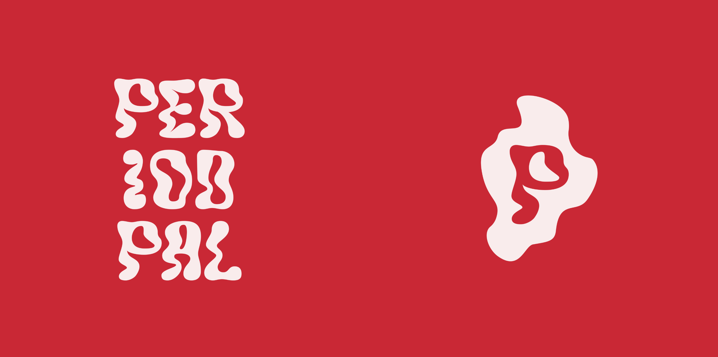
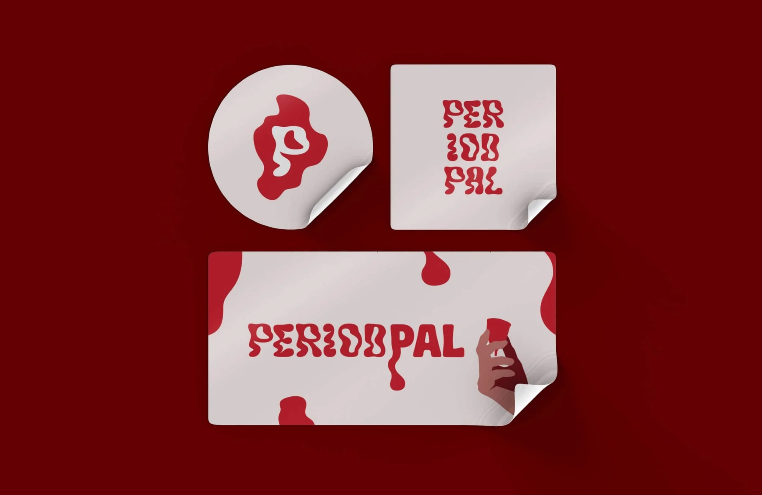
The PeriodPal logo is designed to be striking and fearless. The word "Period" is rendered in a 'wiggly' font, symbolising period blood and challenging the discreet, often timid branding typically associated with menstruation products. The submark features a wiggly ‘P’ set against a blob-like background, echoing the logo’s theme and further reinforcing the message of embracing menstruation openly.
Colour Palette
The colour palette is unapologetically bold, featuring strong reds and pinks that symbolise both empowerment and the reality of period blood. These shades are deliberately chosen to defy the conventional, often muted tones used by other brands in the industry.
Font Selection
To balance the boldness of the logo and colour palette, we selected minimalist, easy-to-read sans-serif fonts. This ensures that the brand’s messaging remains clear and accessible, without detracting from the impactful visual elements.
Icons & Illustrations
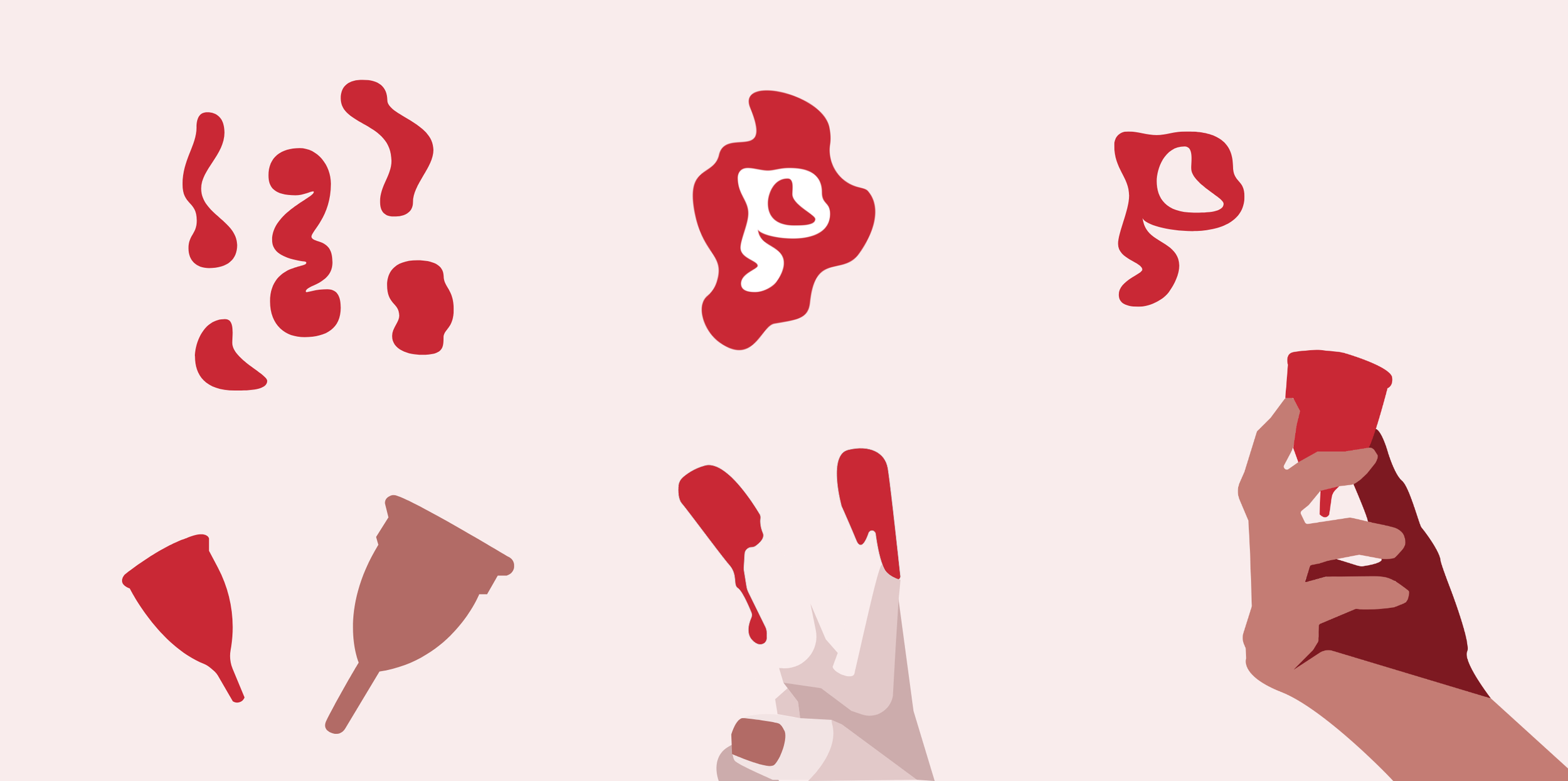
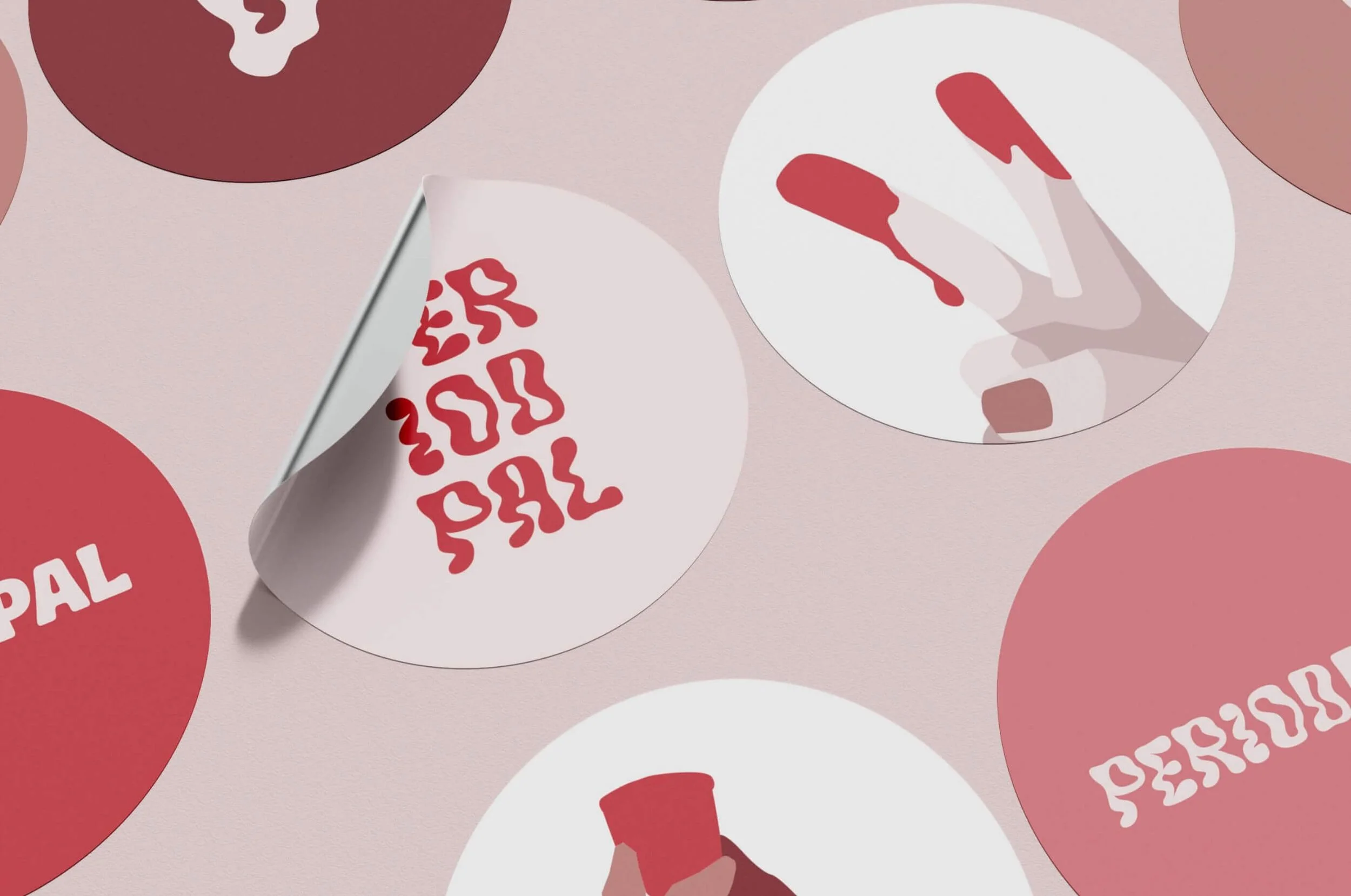
I created a range of custom illustrations to be used across marketing materials. These include imagery of menstrual cups, blood-shaped splodges, drips, and hands holding menstrual products. These visuals are designed to normalise menstruation, combat the stigma around period blood, and encourage a positive connection with one’s body.
Marketing Materials
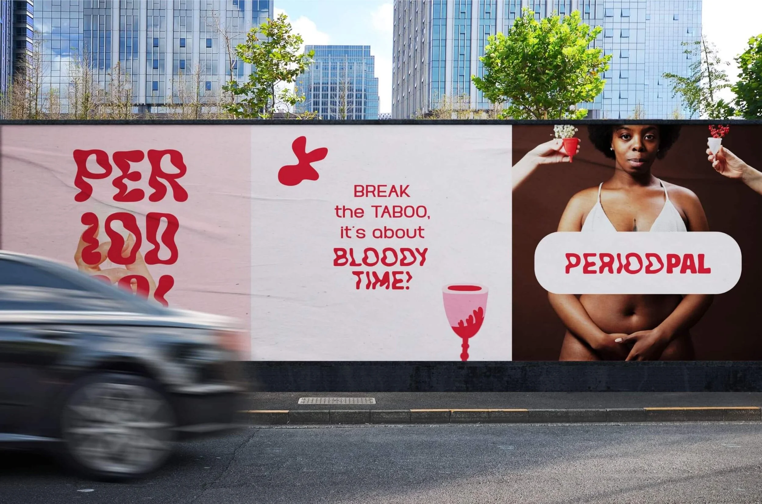
PeriodPal’s branding extends to stickers, badges, and bags, all featuring the logo and custom illustrations. These items serve as both marketing tools and symbols of solidarity for those who support the brand's message. Additionally, I developed a series of posters for bus stops and billboards, all of which focus on inclusivity, body positivity, and breaking down taboos.
Packaging Design
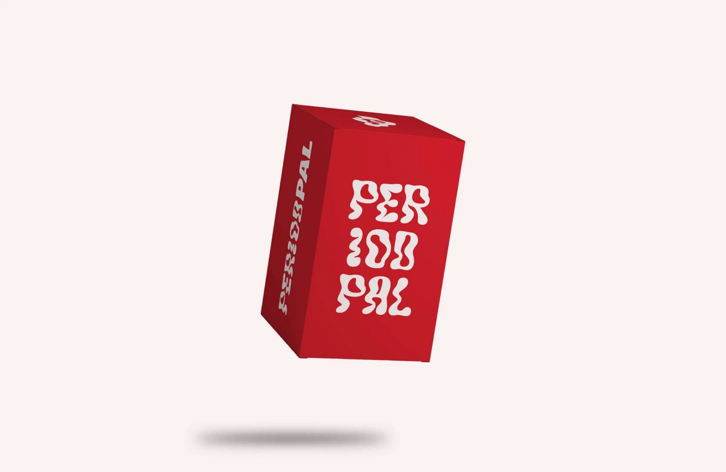
The packaging for PeriodPal is designed to stand out on the shelf with a bold blood-red box and attention-grabbing typography. The packaging is as unapologetic as the brand itself, drawing immediate attention and reinforcing the message that menstruation is natural and nothing to hide.
